Style Manager (Style Properties)
 right click
[left
click]
- How is this dialog organized?
- Create a new object style
- Delete an object style
- Edit object styles
- Tabs
The Style Properties dialog box (also called Style Manager dialog box) can be used to edit the style properties of the selected objects and to create new styles for that object. The following commands open the Style Manager for each object type:
Architectural objects:
- Wall: vaWallStyles
- Curtain Wall: vaCurtainWallStyles
- Beam: vaBeamStyles
- Column: vaColumnStyles
- Door: vaDoorStyles
- Window: vaWindowStyles
- Opening: vaOpeningStyles
- Stair: vaStairStyles
- Railing: vaRailingStyles
- Slab: vaSlabStyles
- Roof: vaRoofStyles
- Furniture: vaFurnitureStyles
- Element: vaElementStyles
Documentation objects:
- Space: vaSpaceStyles
- Table: vaTableStyles
- Tag: vaTagStyles
- Annotation: vaAnnotationStyles
- Guide: vaGuideStyles
- Opening elevation: vaOpeningElevationStyles
- Section Mark: vaSectionStyles
- Section View: vaSectionViewStyles
- Plan View: vaPlanViewStyles
When you run the vaStyleProperties command, the Style Properties
dialog box appears.
This dialog box can be used to edit the style properties of the selected objects.
How is this dialog organized?
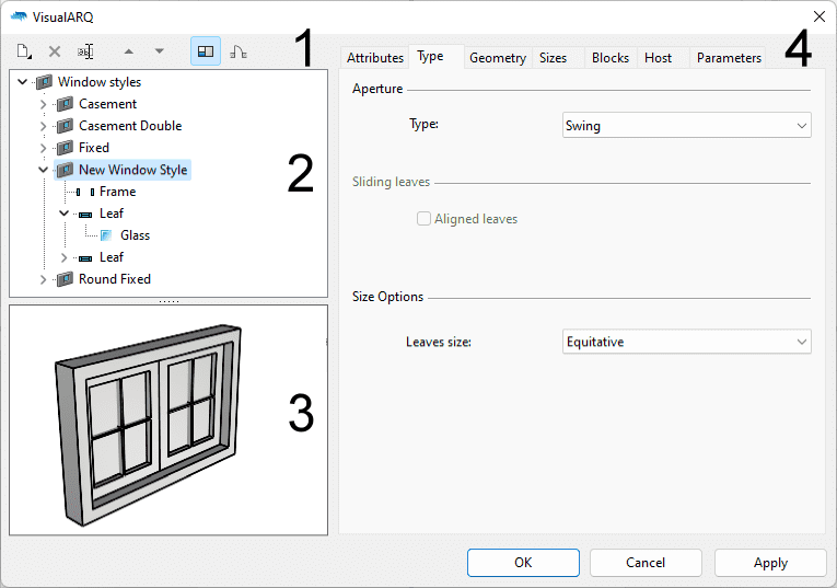
The Style properties dialog is divided into the following areas:

Style Properties dialog box, style properties of a window.
1. Toolbar
 New: adds new object styles and new component items.
 Delete: deletes any object style or object style component after
its selection from the top left panel list.
 Rename: changes
the name of an object style or object style component after its selection from the top left panel list.
Rename: changes
the name of an object style or object style component after its selection from the top left panel list.- Up and Down arrows: change the position of components within an object style.
 Option to
show or hide the Preview window.
 Option to display the object style in Plan or Perspective
view in the preview window.
2. Styles list
It shows the list of styles for the objects selected when running the command. Click on the arrow (or triangle) next to the style or component name in order to expand it and see its sub-components.

Door style components
3. Preview window
It shows the object style selected in Plan or Perspective view. The preview can be changed with the mouse, similar to the method used in Rhino views:
- Right mouse button: you can rotate the viewpoint to display the model from different points.
- Ctrl + Right mouse button: you can zoom in or out to expand or reduce the field of view.
- Shift + Right mouse button: you can move the viewpoint parallel to the plane of vision; upwards, downwards, right or left.
The preview allows the selection of the object style components directly on the model displayed. The selected component will be shown in the top left panel list.
4. Style settings
This area shows different settings and information depending on what is selected in the styles list on the top left panel:
- When the general object styles folder is selected, this area shows the list of existing object styles. At the bottom of the dialog, the options to create a New Style, Duplicate or Delete an existing one from the list above appear.
- When a specific object style or object style component is selected, this area shows the different tabs and properties from where you can edit the parameters of each object style.
Create a new object style
New styles can be created from the following options:
- New icon
 , from the dialog toolbar. It shows two options depending on the object type:
- Object style: a new style will be created with the standard parameters.
- Grasshopper style: opens the grasshopper style wizard.
- New style button
 : It shows two options depending on the object type:
- Object style: for some object types, it opens the New style wizard, whereas for others it creates a new style with the standard parameters.
- Grasshopper style: opens the grasshopper style wizard.
- Context menu: right-click on the object style folder to display the context menu and select New > Object Style or Grasshopper Style.
- Duplicate button: after selecting one style from the right panel list.

Style Manager dialog box for the Railing object.
New Style wizard
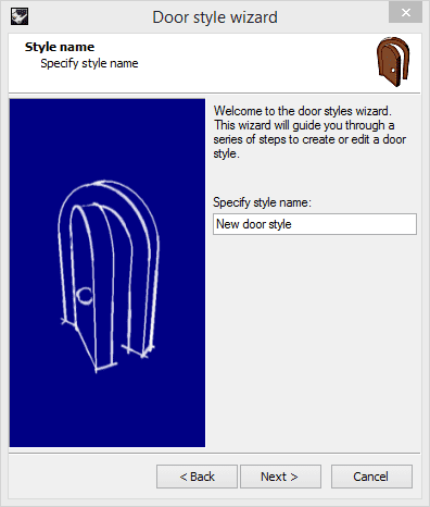
After clicking on New style... button, a wizard will guide you throughout the process, requesting the parameters of the object style defined in simple steps.
Only the Wall, Column, Door, Window, Stair and Table objects use the wizard to create new styles. Furthermore, some object style parameters can be only defined after the wizard is finished. (i.e. the object style attributes, the glass muntins for doors and windows, the stairs slab thickness, etc.).
The object types that don't use the wizard simply add a new object style at the end of the list, after clicking on the New style button.

Door style wizard.
Delete an object style
An object style can be deleted from different options:
- Delete... button: select the object style folder to display the object styles list in the right panel. Select the object style you wish to delete and click on the Delete... button.
- Context menu: right-click on the name of the object style you wish to delete and select Delete.
- Delete icon
 : select
the name of the object style you wish to delete and click on the delete icon
in the dialog toolbar.
NoteOnly object styles that are not being used by any existing objects in the model can be deleted.
Edit object styles
To edit an object style, select the object style or object style component and edit its properties in the tabs located in the right box. These tabs and properties can be different depending on the object type or object component.
To edit object styles created from Grasshopper definitions, do right click on the Style name and select Edit... This operation will open the New style Wizard for Grasshopper styles.
Tabs
Attributes
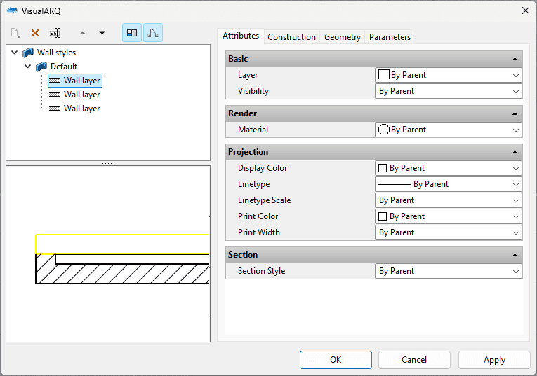
This tab is displayed for all objects that use a dialog box. The tab defines the features (attributes) of each object style and each of its components. The attributes vary depending on the object style they apply to.
- Basic:
- Layer
- Visibility
- Render: (for the architectural objects only)
- Material
- Annotation: (for documentation objects only)
- Annotation style:
- Model Scale
- Font
- Text Height
- Text Alignment
- Annotation style:
- Projection:
- Display Color
- Linetype
- Linetype Scale
- Print Color
- Print Width
- Projection Hatch: (for the Space object only)
- Pattern
- Pattern Rotation
- Pattern Scale
- Pattern Color
- Pattern
- Section: (for the architectural objects only)
The values for these attributes can be assigned in different ways:
- By Object: the object style or the component will use the attributes assigned directly to the object.
- By Parent: the object style or the component will inherit the attributes assigned to its parent.
- By Layer: the object style or the component will inherit the attributes assigned to the layer where it is located.
- By Projection: the object/component will inherit the attributes assigned to the Projection group of attributes.

Attributes tab in the wall styles dialog.
Geometry
All objects except stairs, slabs and roofs have this tab. The geometric values of each object and object component are defined in this tab.Geometric values for the Wall object:
- Height
- Thickness (can only be edited for each wall layer)
- Height
- Profile (defines the object shape)
- Coating thickness (only for columns)
- Profile (defines the object shape)
- Sizes (width and depth) for the frame and doorstop
- Sizes (width and depth) and opening side for the leaf
- Sizes (thickness, extension and depth) for the sill (only for Windows and Openings)
- Rail component: Ending margins and style. Planar and non-planar joints.
- Balusters: Top and bottom margins.
Sizes
This tab is only used for the objects that use profiles to define their shape (columns, doors, windows and openings). This tab is used to define the Sizes (width and height) of the profile used by the object. This option can be used to create different sizes for the same profile.
Blocks
This tab defines the 2D (Plan) and 3D (Model) representations of the object, assigning a block that has been previously created by the user.
This tab only appears for objects that can be created from blocks:
- Doors
- Windows
- Openings
- Columns
- Furniture objects
- Elements
- Annotation objects
Construction and Wrapping
Only walls have this tab. This tab is used to define how the wall layers finish at the end caps of a wall, and at their encounter with openings. The construction tab is used to define the wall layers type and function.
Type
Only stairs have this tab. It is used to define the type of stair used, depending on whether the Balanced stair option is activated or not.
Steps
Only stairs have this tab, where the geometric values of the tread and riser slabs can be specified.
- Geometric values for the Tread slab:
- Slab thickness
- Nosing
- Geometric values for the Riser slab:
- Slab thickness
Division and Infill
Only Curtain walls have these tabs. They are used to define the parameters of the Cell component.
